Simplifying a high-stakes mortgage application flow for first-time buyers, existing members, and refinancing journeys.
I led an end-to-end redesign of a digital mortgage application experience that was long, jargon-heavy, and split between MDX and the Loan Center. The redesigned experience clarified entry routing, reduced cognitive load, improved in-flow guidance, and helped members move through pre-qualification, pre-approval, and application steps with more confidence.
Audio walkthrough
A short spoken overview of the case study for recruiters and hiring managers who want the quick story before scanning the full page.
Overview
The design challenge was not just reducing steps. It was building confidence.
Members needed to understand where they were, which mortgage path fit their situation, what information was required, and what would happen next. The previous experience made those decisions harder because the flow was fragmented, language was technical, and support moments lived outside the product.
Impact at a glance
Clearer guidance improved completion, conversion, and self-service confidence.
65→78%Task completion improved after simplifying the flow and clarifying next steps.
33%Increase in overall application conversion from improved routing and reduced friction.
100+Member survey responses helped identify where people got stuck.
6Loan officer interviews revealed recurring confusion, rework, and avoidable calls.
Problem and goals
The original flow created confusion before members could build momentum.
Before
Long, jargon-heavy application experience.
Unclear distinction between pre-qualification, pre-approval, refinance, and full application.
Scattered question groupings across MDX and Loan Center.
Weak re-entry and status visibility when members returned later.
Members relied on loan officers for guidance the product should have provided.
After
Guided entry flow based on member intent.
Plain-language explanations and clearer next-step expectations.
Better grouped financial questions with reduced context switching.
Contextual tools, calculators, examples, and support paths.
Stronger progress, re-entry, and status feedback.
Constraints
Mortgage design has real limits. The solution had to simplify without breaking compliance or systems.
01
Regulatory and legal review
All changes had to remain compliant with lending regulations and pass legal and risk review.
02
Legacy systems
The front end still had to support existing back-end services and required fields.
03
Design system alignment
The redesign needed to work within enterprise components, typography, and interaction patterns.
04
Engineering capacity
The team prioritized improvements that could ship within a fixed release timeline.
05
Required disclosures
Some content could be clarified, but not removed or over-simplified beyond compliance requirements.
06
Multi-surface journey
Members moved between app and web experiences, so continuity and re-entry mattered.
Research plan and methods
We combined member feedback, loan officer insight, and product evaluation.
01
Member survey
Surveyed about 100 members to understand where people got stuck, what they expected, and what pushed them to call.
02
Loan officer interviews
Conducted six 60-minute interviews to capture recurring member confusion, rework, and support patterns.
03
Heuristic audit
Evaluated usability issues across language, hierarchy, progress, re-entry, and task flow.
04
Competitive review
Compared mortgage and lending experiences to identify clearer entry, guidance, and calculator patterns.
05
Product walkthroughs
Mapped end-to-end friction across the online Mortgage Application and Loan Center.
06
Team synthesis
Converted research themes into priorities for flow, language, tools, status, and re-entry.
Key insights
The biggest blockers were clarity, confidence, and in-product support.
01
Members did not trust what they did not understand.
Banking language made important steps feel more intimidating than they needed to be.
“We need more common language for the member.”
02
The flow did not match how members think.
Questions were grouped around system needs instead of user expectations, which increased context switching.
03
Missing tools pushed members out of the product.
Without calculators, examples, or contextual guidance, members relied on loan officers for questions the interface could answer.
04
Returning users lacked confidence.
Weak status cues made it hard to know what was complete, what was missing, and what to do next.
05
Entry routing shaped the whole journey.
If members started in the wrong path, confusion compounded across later steps.
06
Guidance had to be timely.
Support worked best when it appeared directly next to the decision or form field where uncertainty happened.
Design decisions
Each decision focused on helping members understand their path and keep moving.
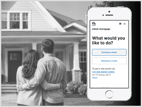
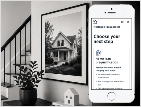
01
Create a guided entry path
Members needed help choosing the right mortgage path before entering a long application.
02
Replace jargon with plain language
Labels, helper text, and CTAs were rewritten to make expectations clearer.
03
Reorganize financial information
Related questions were grouped together to reduce context switching and miscategorization.
04
Add contextual tools
Calculators, examples, and agent-connect options helped members answer questions without leaving the flow.
05
Strengthen re-entry and status
Progress and next-step guidance helped returning users regain confidence quickly.
06
Use progressive disclosure
The flow reduced visual weight by showing details when they were relevant, not all at once.
AI-assisted exploration
AI helped accelerate exploration. Research and judgment shaped the final direction.
I used AI as an exploration and evaluation tool during early problem framing, UX copy variation, edge-case discovery, and synthesis. Final decisions stayed grounded in member research, compliance constraints, usability principles, and enterprise design system standards.
Compared alternate UX copy for high-anxiety credit and eligibility moments
Pressure-tested edge cases around re-entry, missing documents, and unclear status
Explored flow variations for pre-qualification, pre-approval, and full application paths
Summarized research notes into discussion themes for product and design review
Design highlights
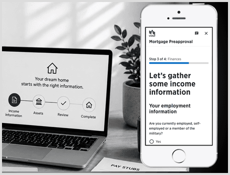
Prototype screens focused on entry routing, financial clarity, and guided progress.
The finances step broke income capture into clearer sections and used targeted guidance to prevent miscategorization.
Problem
Financial questions created confusion and context switching.
Change
Grouped related inputs with helper text and progressive disclosure.
Why it mattered
Improved accuracy and reduced the need for support.
Outcome and measurement
The redesign improved the path through the application and created a clearer measurement plan.
The strongest product signal was improved completion and conversion from clearer language, better sequencing, stronger entry routing, and more useful in-flow support. The next layer of measurement focused on where members dropped, returned, called for help, or misunderstood path selection.
Drop-off rate by application step
CTA selection accuracy across pre-qual, pre-approval, and full application
Loan officer call volume tied to application confusion
Re-entry success rate after users paused the application
Time to complete income, asset, and liability sections
Microcopy A/B test performance for entry routing and guidance
Reflection
What made this work matter was the balance between clarity, compliance, and confidence.
Mortgage applications are high-stakes because users are making financial decisions that affect their future. The design opportunity was to make a required, regulated process feel less intimidating without removing necessary detail. The result was a more guided experience that helped members understand the path, answer questions in context, and return with a clearer sense of what to do next.
Designing complex financial workflows into clearer product journeys.
Case study rebuild for senior product design interviews, portfolio reviews, and recruiter scanning.