Overview
The design challenge was not just resetting a password. It was rebuilding trust during a stressful moment.
Customers came into the flow frustrated, locked out, or unsure which account information they needed. The experience had to collect the right identity details while keeping the path simple, secure, and understandable on a small screen.
Impact at a glance
Clearer recovery guidance reduced confusion and supported more successful self-service.
+18%Increase in successful self-service completion after improving guidance and recovery path clarity.
-25%Reduction in recovery-related friction from clearer instructions and fewer dead ends.
3Core recovery moments redesigned: identify, verify, and reset.
MobilePrimary design surface optimized around small-screen completion and scanning.
Problem and goals
The original recovery flow asked for sensitive information before users understood the path.
Before
- Users were unsure why certain identity fields were required.
- Recovery options were not always clear or easy to compare.
- Mobile layout created extra scanning and form-entry friction.
- Error states did not always explain how to recover or continue.
- Customers could abandon the flow and call support instead.
After
- Clearer page purpose and plain-language instructions.
- More visible recovery choices and next-step expectations.
- Improved form hierarchy, spacing, labels, and mobile tap targets.
- Better inline support for forgotten user ID and account matching.
- Fewer confusing moments before verification and reset.
Research plan and methods
We looked for the moments where users lost confidence or left the recovery path.
01Flow audit
Mapped the password reset journey from entry through verification and completion.
02Heuristic review
Evaluated form clarity, visual hierarchy, error recovery, accessibility, and mobile usability.
03Support patterns
Reviewed the points where customers were most likely to need help or abandon self-service.
04Prototype testing
Validated whether users could understand the page purpose, complete fields, and choose the right next step.
05Content review
Refined labels, helper text, and error messaging to explain requirements without adding clutter.
06Accessibility pass
Checked focus order, contrast, target sizing, readable labels, and clear feedback states.
Key insights
The biggest blockers were uncertainty, field confidence, and recovery fallback clarity.
01Users needed to know why information was being requested.
Identity fields felt more trustworthy when the page explained the purpose in plain language.
02Forgotten user ID was a major branch point.
The forgot-user-ID path needed to feel connected to the recovery task, not like a separate dead end.
03Mobile spacing affected confidence.
Small labels, tight spacing, and weak hierarchy made the flow feel more difficult than it was.
04Error messages needed to tell users what to do next.
Generic errors increased frustration because users could not tell whether the issue was the user ID, last name, or account match.
05Security language had to be direct but calm.
Users needed reassurance without over-explaining policy or making the flow feel intimidating.
06Progressive guidance worked better than long instructions.
Short, timely guidance helped users continue without forcing them to read a large block up front.
Design decisions
Each decision focused on making the next step obvious and the recovery path feel safe.
01Clarify the page purpose
Used a direct heading and supporting line so users knew exactly what the page was asking for.
02Improve form hierarchy
Made labels, fields, helper links, and CTAs easier to scan on mobile.
03Keep recovery options visible
Made fallback paths like forgot user ID and pay without signing in easier to find.
04Strengthen button states
Disabled and active states were designed to make field requirements more understandable.
05Write calmer error guidance
Error states focused on the fix rather than the failure.
06Design for small-screen recovery
The mobile layout prioritized one clear task at a time with strong spacing and readable hierarchy.
Design highlights
Prototype screens focused on identifying the user, verifying identity, and completing reset.
Password reset entry
The first screen focused the user on two required fields and kept the recovery helper link close to the point of need.
ProblemUsers were not always sure what information was needed.
ChangeImproved heading, labels, spacing, and field hierarchy.
Why it matteredReduced uncertainty at the start of the reset flow.
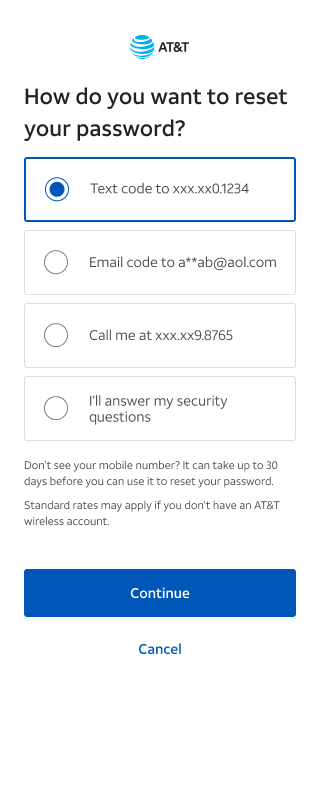
Recovery options
Users could choose a verification method with clearer expectations about what would happen next.
ProblemRecovery choices felt disconnected and unclear.
ChangePresented options as scannable choices with plain-language descriptions.
Why it matteredHelped users continue without calling support.
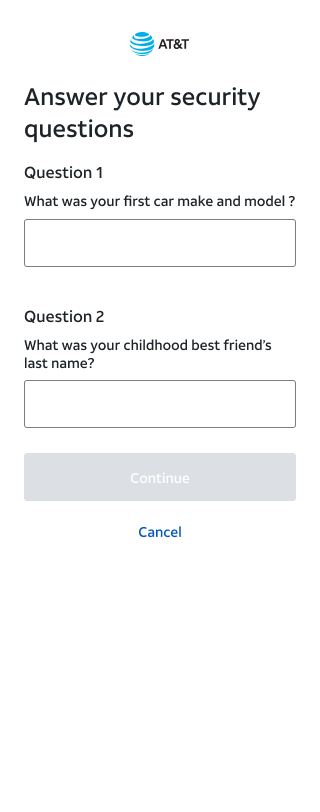
Verification and reset
The final steps emphasized clear feedback, calm security language, and direct next actions.
ProblemUsers needed reassurance during sensitive verification steps.
ChangeClarified states, messages, and actions after verification.
Why it matteredBuilt confidence while keeping the account secure.
Outcome and measurement
The redesigned flow made account recovery easier to understand without weakening security.
The strongest product signal was better self-service confidence. The experience became easier to scan, clearer about required information, and stronger at routing users to the right recovery option.
Password reset completion rate
Drop-off by recovery step
Forgot user ID path usage
Support call volume tied to account recovery
Error rate by form field
Time to complete reset on mobile
Reflection
What made this work matter was the balance between security, usability, and trust.
Account recovery is a small moment with a high emotional load. The design opportunity was to keep the process secure while making each step feel understandable, recoverable, and respectful of the customer’s time.