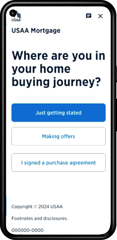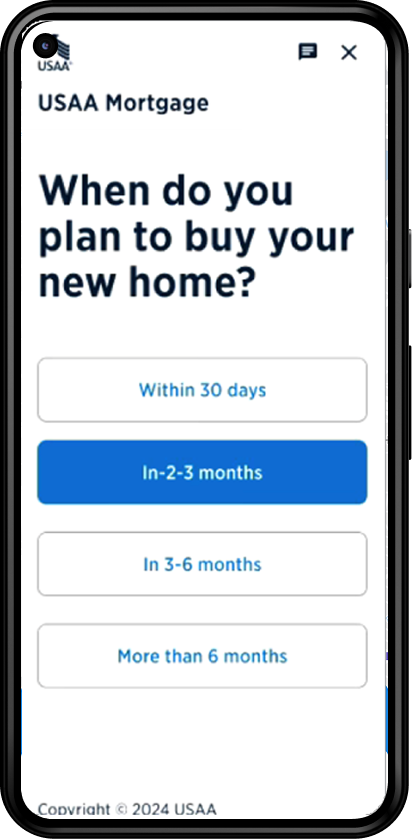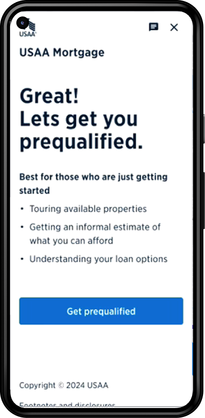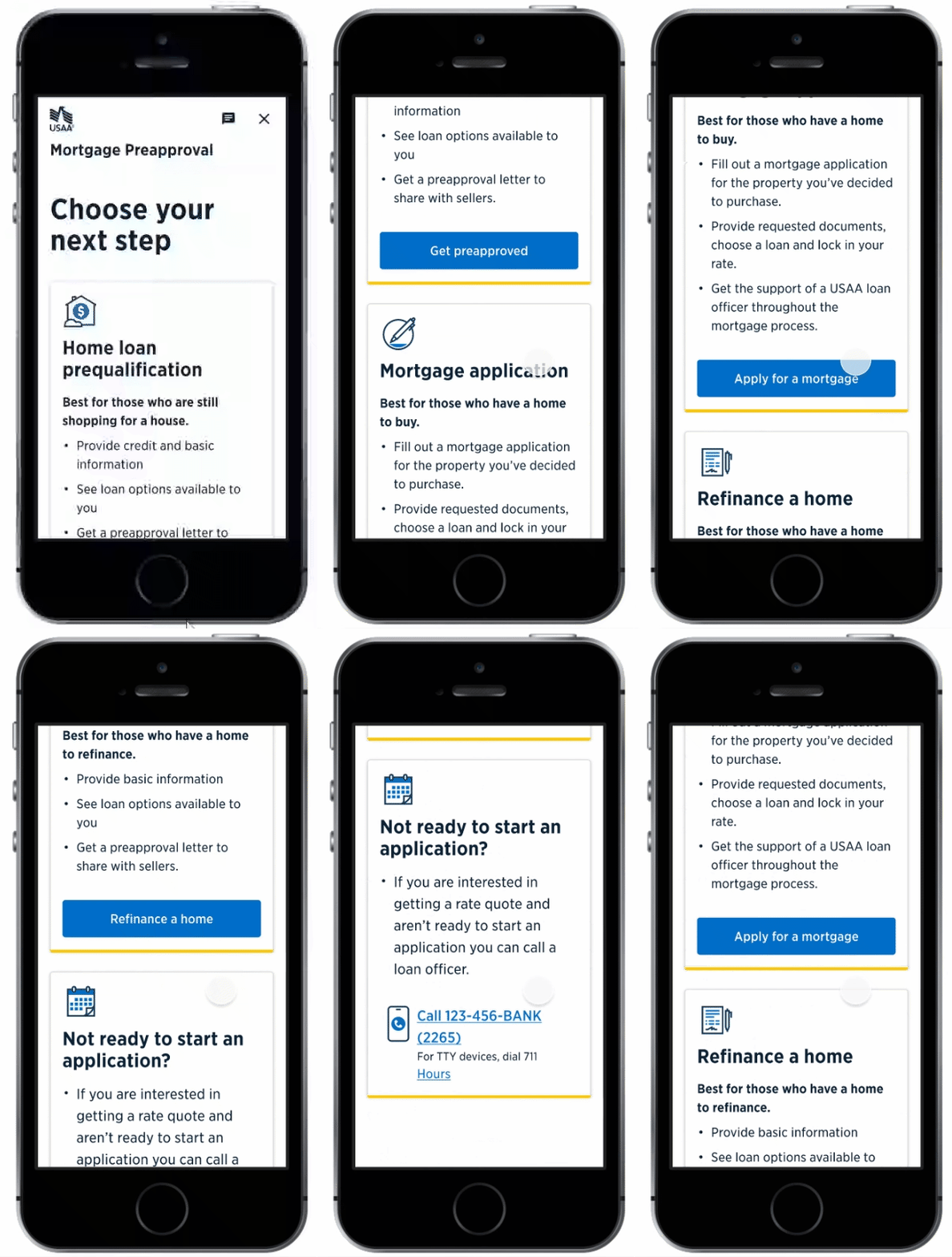
Project Overview USAA Mortgage Application Redesign
Listen
USAA Mortgage Application Redesign
Problem Statement
The original mortgage application process was fragmented, slow, and confusing—especially for first-time homebuyers. Internal analytics showed a 52% drop-off before users completed document upload, and support call volume related to loan status and ID verification had increased by 27%. Our goal was to create a clearer, faster, and more supportive digital experience—while staying compliant with financial regulations and accessibility standards.
Results & Outcomes
- Completion rate increased from 48% to 71% within 60 days post-launch.
- Average time to complete the application dropped by 35%.
- Calls to support about loan status fell by 22%.
- Accessibility errors flagged in audits were reduced to zero.
User Research & Testing
We tested with 12 users (split between first-time buyers and returning customers) using moderated sessions and recorded walk-throughs.
- Key insight: Users were uncertain when document uploads failed—there was no clear feedback.
- Design change: We introduced progress indicators and real-time validation for document uploads.
Design Iteration
In early designs, we grouped “Loan Options” and “Verification” in one screen. Testing showed this was overwhelming—users hesitated or abandoned.
Update: We separated them, introduced a step-by-step flow, and added contextual help. This reduced abandonment by 15% in that step.
Collaboration & Constraints
- Worked with legal/compliance teams to meet mortgage disclosure standards (RESPA, TILA).
- Partnered with front-end engineers to audit legacy code and reduce rework in component integration.
- Navigated handoffs across time zones, using detailed Figma specs and Loom walkthroughs.
Challenges & Tradeoffs
Mid-project, requirements changed due to updated underwriting policies. We had to rework the application logic while maintaining UI integrity. I prioritized user trust and continuity, keeping layouts consistent while updating data models behind the scenes.
Looking Back
If I had more time, I would’ve advocated for more proactive in-app education around loan types. Some users were still confused about terms, even with tooltips. I’d also push to integrate live chat earlier, based on support feedback. Small changes like these could further boost trust and confidence.
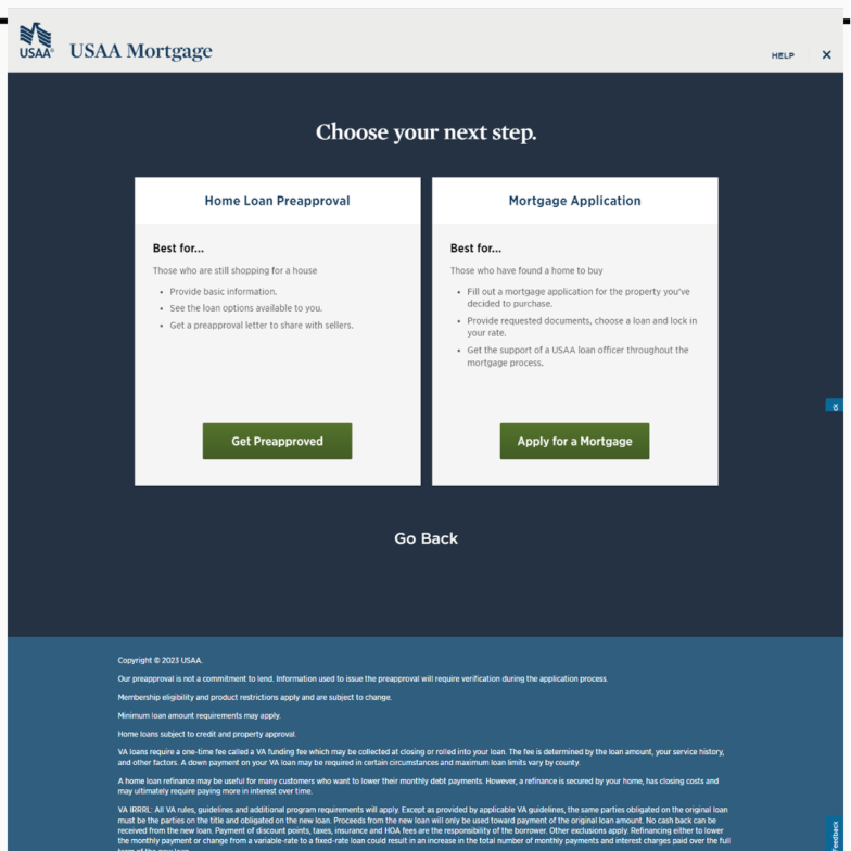
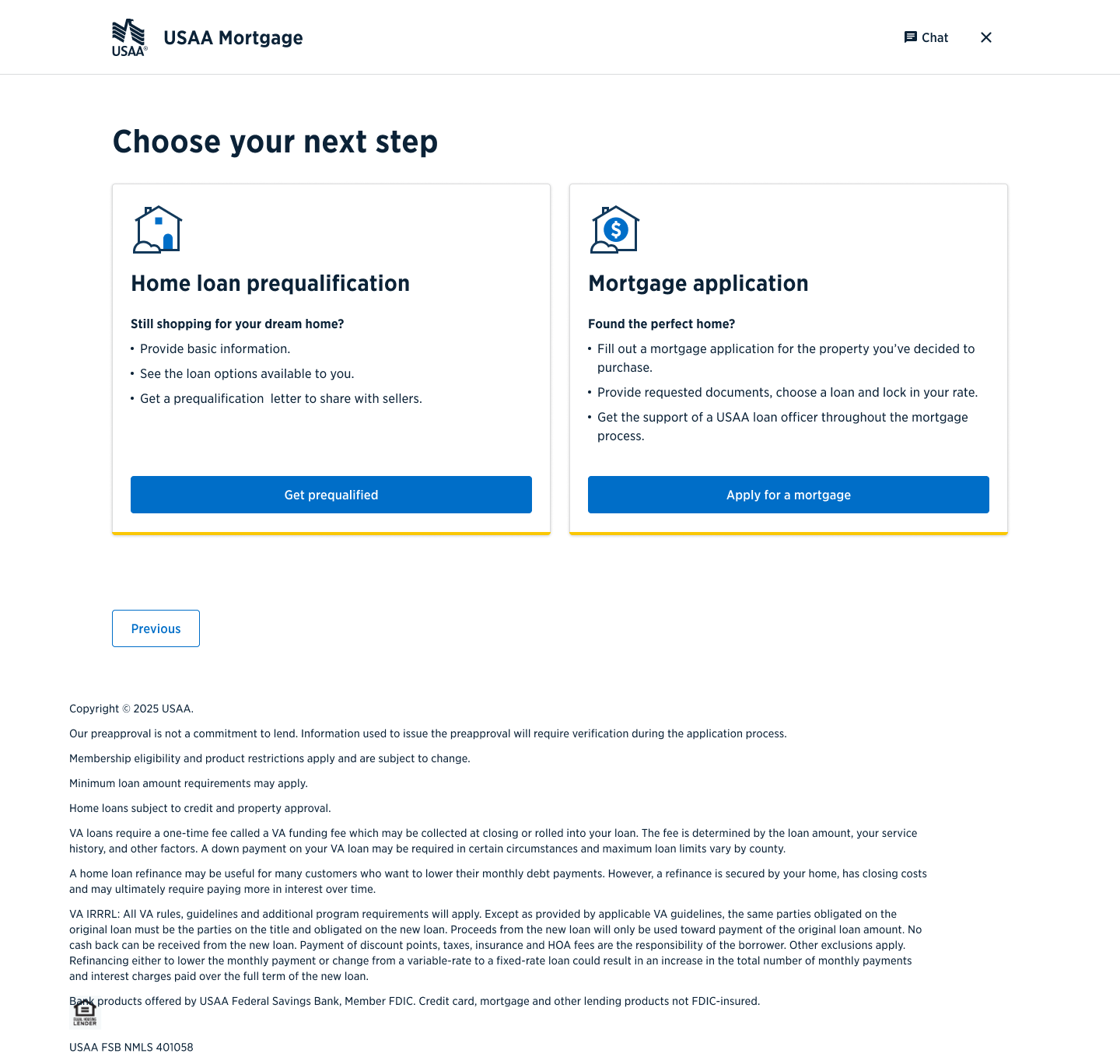
Before and After
Recommendations
Impact
